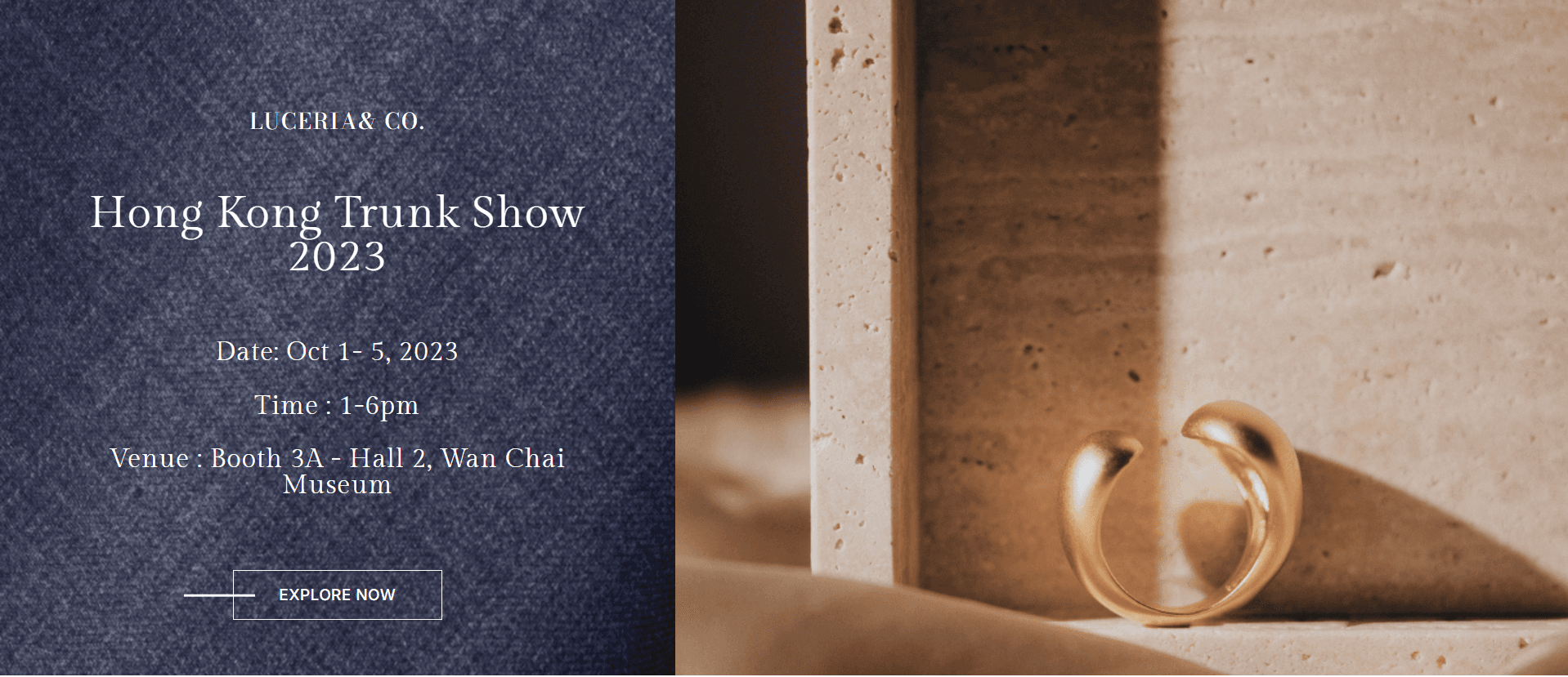

About this project
This jewelry landing page explores a different interaction model: horizontal scrolling navigation instead of a traditional vertical long-page. The Figma design called for an immersive left-to-right journey, and I implemented that experience with HTML, CSS, and vanilla JavaScript only — no slider libraries.
Horizontal storytelling is easy to get wrong. Users still need orientation, reachable sections, and mobile fallbacks that do not trap scroll. I built custom scroll and navigation logic so content sections advance in a controlled flow while remaining usable with keyboard and pointer input. Layout systems keep typography and product visuals refined as panels move.
Avoiding third-party animation libraries was intentional. It forced precise control over scroll positions, section widths, and performance. The result is a distinctive browsing experience that still communicates product hierarchy clearly — not novelty for its own sake.
Responsive adaptation required careful decisions: when to preserve horizontal motion, how to stack content on smaller viewports, and how to keep CTAs visible. The GitHub Pages demo shows the finished interaction model and visual polish.
This project demonstrates advanced layout and interaction engineering in vanilla JS — useful when a brand wants a memorable web experience without a heavy framework.
Unusual navigation only works when users never feel lost. I added clear section boundaries and interaction feedback so the horizontal model stays exploratory rather than confusing. Building it in vanilla JavaScript also makes the technique portable to other brand experiments.
This project is a useful signal of interaction design skill: custom scroll systems, layout math, and restraint in visual effects.