
About this project
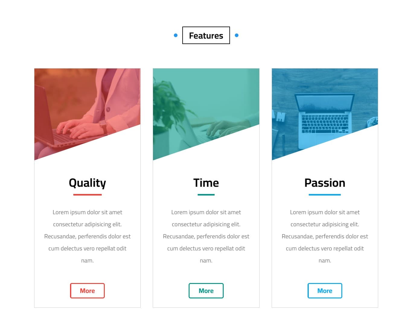
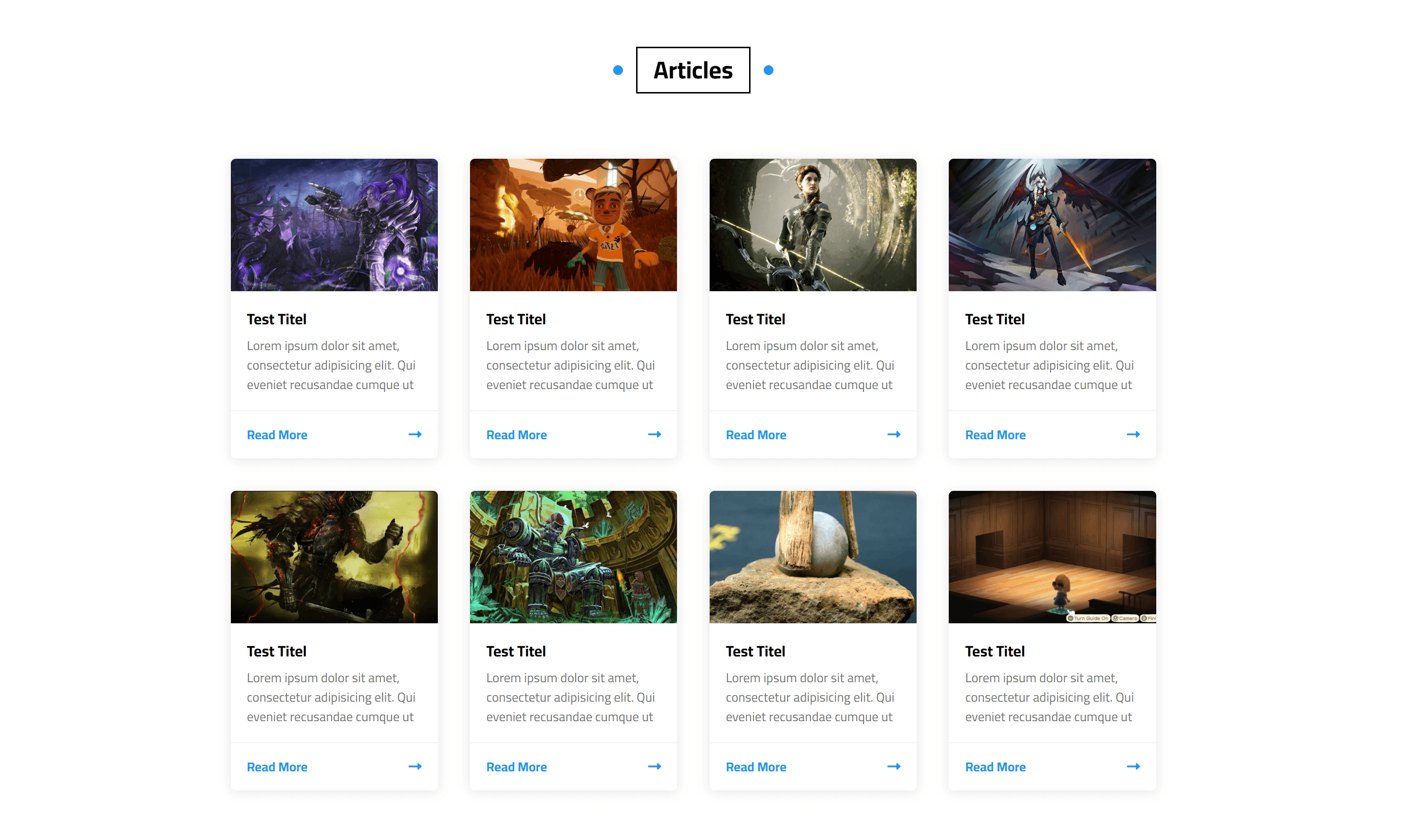
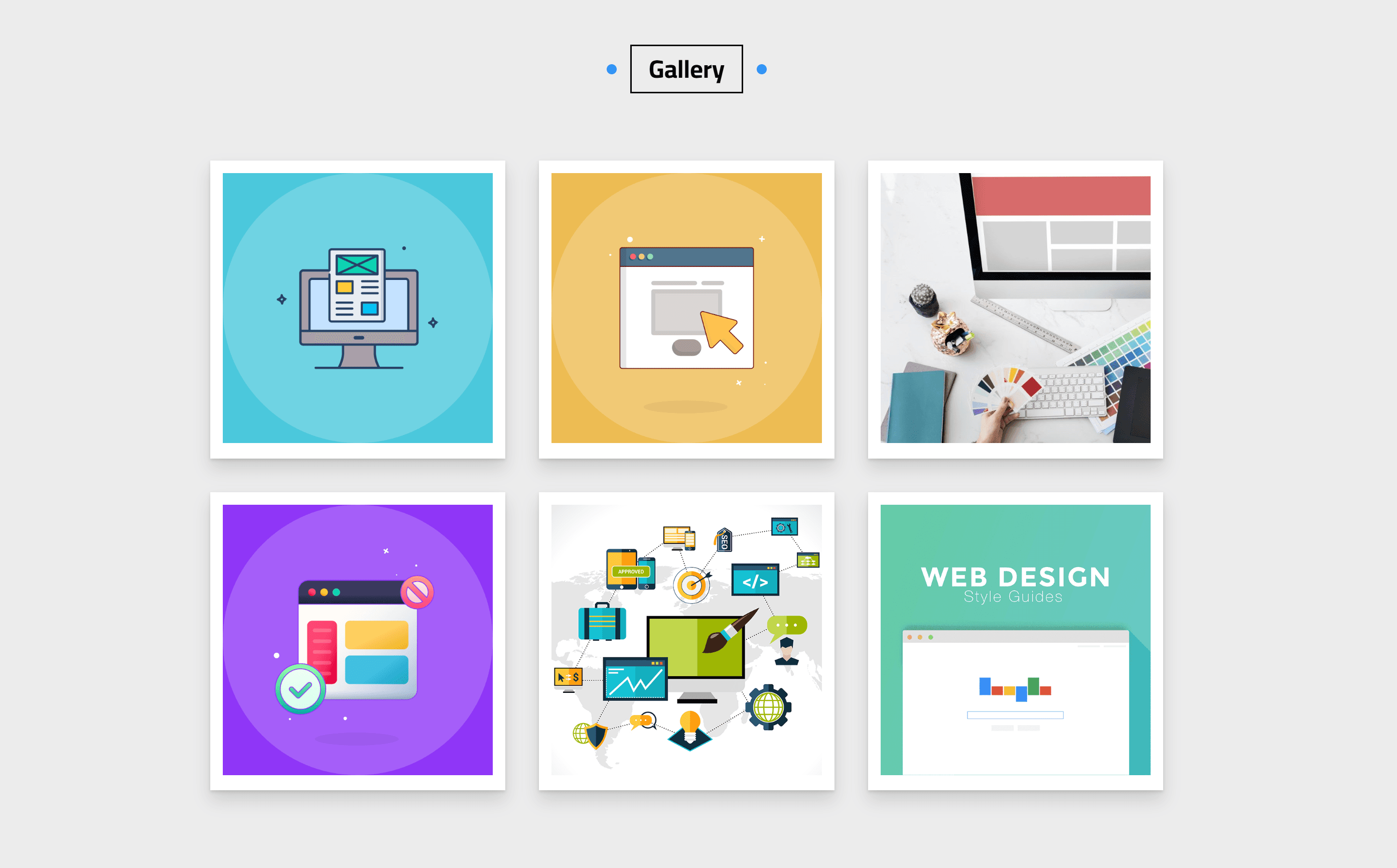
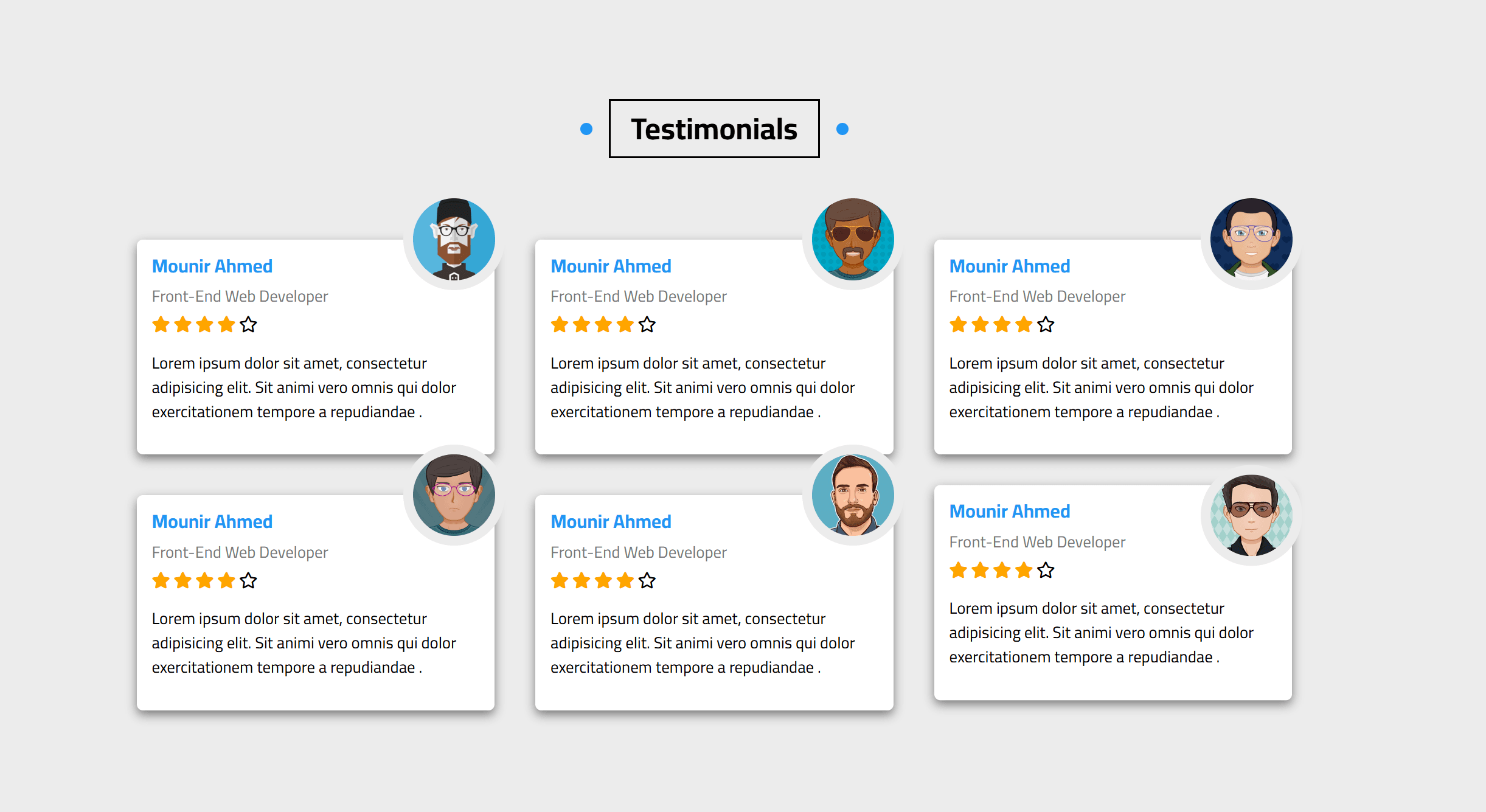
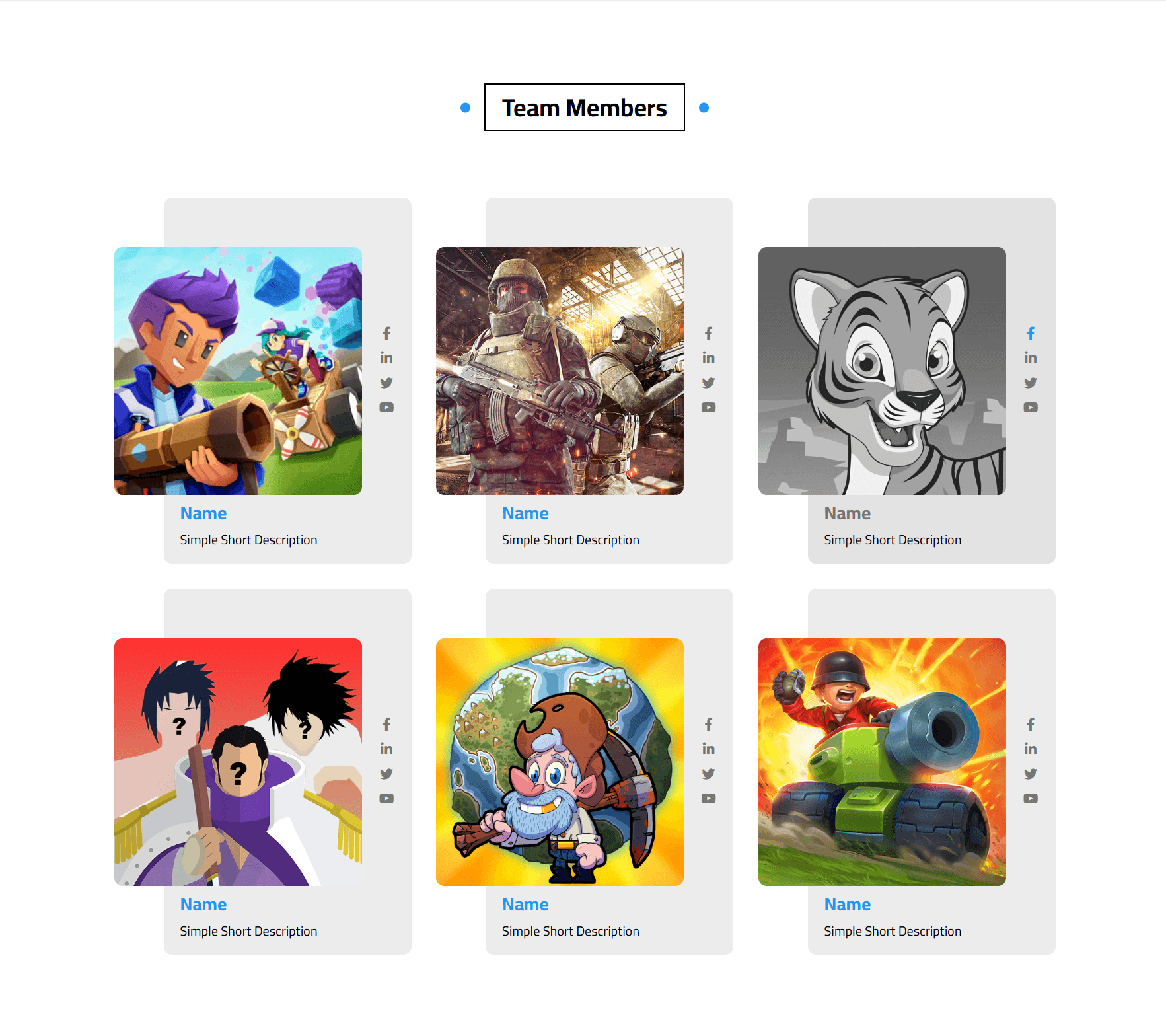
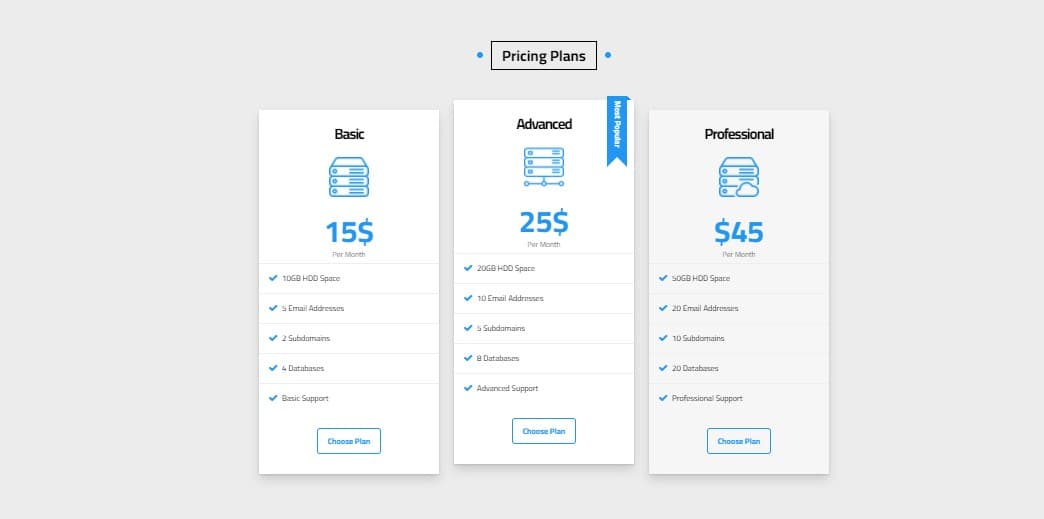
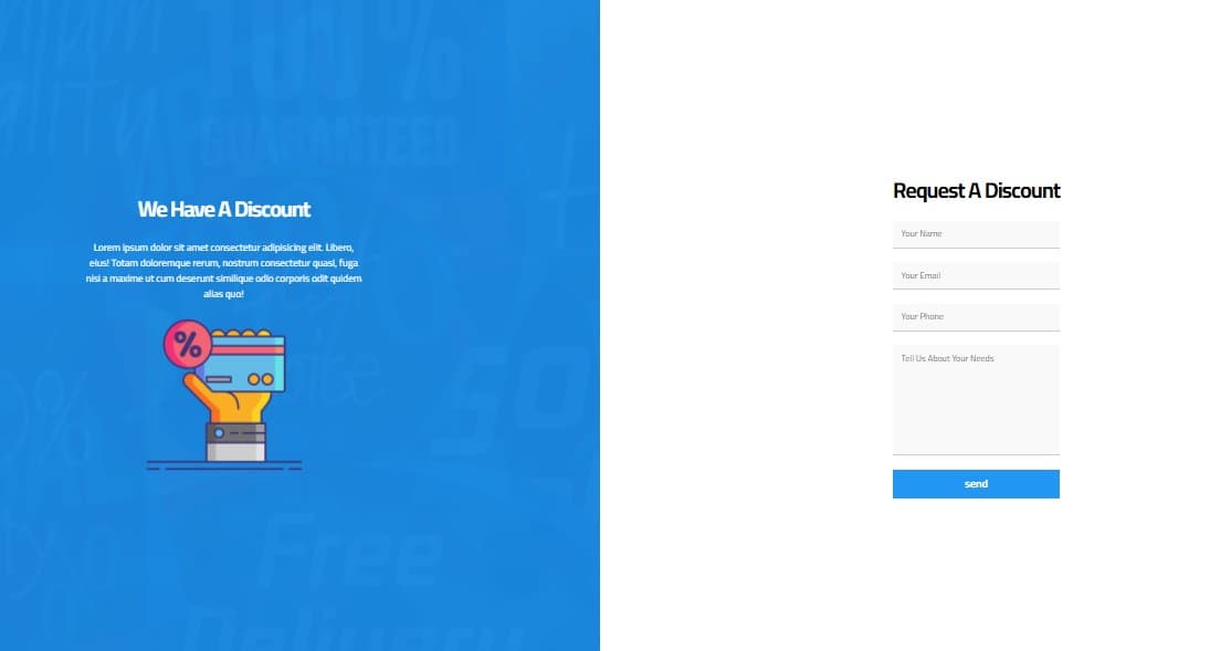
Mounir's World Template is a full-page responsive frontend template I converted from PSD designs into HTML, CSS, and JavaScript. It was built as a showcase of layout craftsmanship: multiple content sections, decorative motion, and interactive details that still stay performant.
Template work forces discipline. Every section — hero, features, galleries, CTAs, footers — must feel cohesive while remaining flexible enough for different content later. I implemented the structure with semantic HTML and modular CSS, then layered JavaScript for animations and UI manipulation that respond to scroll and user interaction.
Cross-device behavior was a primary success metric. The template adapts layouts for mobile, tablet, and desktop without breaking ornamental details that often collapse poorly in rushed conversions. I tuned typography, spacing, and media so the “pretty” parts of the design still feel intentional on small screens.
You can explore the live GitHub Pages demo to see the section variety and motion. Beyond looking finished, the codebase is meant to be readable: clear class patterns and straightforward scripting so another developer could restyle or extend it.
This project highlights my PSD-to-code skills — translating visual design into structured, animated, fully responsive pages without leaning on a JavaScript framework.
Templates are judged harshly because every imperfection is visible. I spent time on animation timing, hover states, and section transitions so the page feels crafted rather than assembled. The public demo is useful both as a portfolio piece and as a reference for clean static frontend structure.
This kind of PSD-to-code work remains relevant for agencies and freelancers: clients still need faithful conversions that survive real browsers and real content length, not just design-mode widths.