CSS has spent years borrowing powerful ideas from programming languages — variables, math with
calc()@media@supportsFor years, developers relied on media queries,
@supportsWhat Is the CSS if() Function?
The if() function is a value-level conditional. Instead of wrapping large blocks in
@media@supports- Style queries — check the value of a custom property, e.g.
.style(--theme: dark) - Media queries — check the environment, e.g. screen width, orientation, or
.prefers-color-scheme - Feature queries — check whether the browser supports a value or property, e.g.
.supports(display: subgrid)
Conditions are evaluated in order, and the first one that matches wins — exactly like
if / else if / elseBasic syntax
property: if(condition: value);With a fallback:
property: if(condition: value; else: fallback);Each branch is separated by a semicolon, and the special
elseelse1. Responsive Values With if()
Here's how you can change spacing depending on screen size:
.container {
  margin-block: if(
    media(width < 700px): 0;
    else: 2rem
  );
}
Instead of writing two separate media queries, you keep all the logic in one place. For comparison, the traditional approach needed a base rule plus an override:
.container { margin-block: 2rem; }
@media (width < 700px) {
  .container { margin-block: 0; }
}
Both do the same thing, but the if() version keeps the decision right next to the value — a real readability win for design tokens and tightly-scoped components.
2. Feature Detection (Built-In Fallbacks)
One of the most practical uses of if() is checking browser support inline:
.box {
  color: if(
    supports(color: lch(60% 50 40)): lch(60% 50 40);
    else: #555
  );
}
If the browser supports lch() colors it uses them; if not, it gracefully falls back to a safe hex value. You can use the same pattern for layout features:
.grid {
  display: if(
    supports(display: subgrid): subgrid;
    else: grid
  );
}
This is far cleaner than writing long, repetitive
@supports3. Custom Theming With Style Queries
You can branch on the value of a custom property, which makes theming trivial:
:root {
  --scheme: "ice";
}
h1 {
  color: if(
    style(--scheme: "ice"): #0466c8;
    else: #d00000
  );
}
This is great for website themes, dark-mode toggles, and user settings. A single custom property can drive an entire palette:
.button {
  background: if(style(--theme: dark): #1f2937; else: #f3f4f6);
  color: if(style(--theme: dark): #f9fafb; else: #111827);
}
Flip
--theme4. Multi-Level Conditions (if / else if / else)
The order of conditions matters — only the first true branch applies:
.card {
  padding: if(
    media(width > 1200px): 2rem;
    media(width > 600px): 1.5rem;
    else: 1rem
  );
}
This single declaration replaces an entire stack of media queries with one tidy function. Just remember to order your conditions from most specific to least specific, or an earlier branch may “win” before the one you intended.
How if() Differs From @media, @supports, and Container Queries
It's important to understand that if() does not replace these tools — it complements them:
- @media / @supports wrap whole blocks of rules. Use them when many properties change together.
- Container queries respond to a parent's size rather than the viewport — still the right tool for truly component-driven layouts.
- if() shines when only one value needs to change, keeping that decision inline and DRY.
Reach for if() when a block-level query would be overkill for a single property.
Browser Support & Progressive Enhancement
if() is still rolling out. It first shipped in Chromium-based browsers (Chrome and Edge 137, mid-2025), while Firefox and Safari are still catching up. That means you should treat it as progressive enhancement and always include a regular fallback property first:
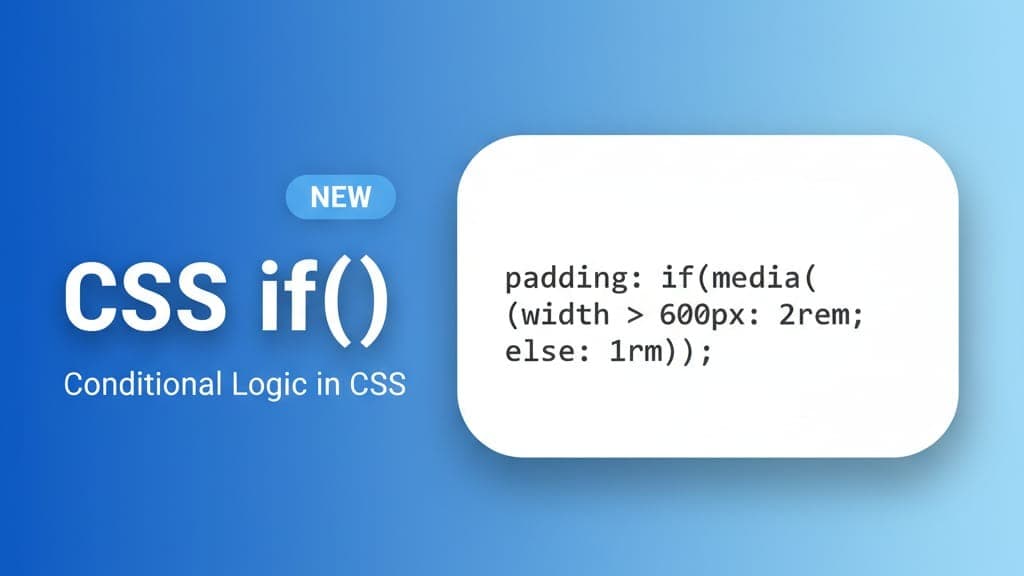
padding: 1rem; /* fallback for older browsers */
padding: if(media(width > 600px): 2rem; else: 1rem);
Browsers that don't understand the second declaration simply ignore it and use the first — the normal CSS cascade doing its job.
Common Mistakes to Avoid
- Forgetting the plain fallback declaration — without it, unsupported browsers get no value at all.
- Over-nesting conditions — deeply chained branches quickly become hard to read; sometimes a media-query block is clearer.
- Using it for layout that container queries handle better — pick the tool that matches the intent.
- Wrong condition order — remember the first match wins, so order from specific to general.
Frequently Asked Questions
Is the CSS if() function production-ready?
Not universally yet. It works in recent Chromium browsers but isn't supported everywhere, so use it as an enhancement with a solid fallback rather than a hard dependency.
Does if() replace media queries?
No. It's perfect for changing a single value, but
@mediaCan I use if() with custom properties?
Yes — style queries (
style(--x: y)Does it work with React, Vue, or other frameworks?
Absolutely. if() is plain CSS, so it works in any framework or styling setup, including CSS Modules, Tailwind's arbitrary values, and styled-components.
Final Thoughts
The new CSS if() function is a game-changer for writing smarter, more modular styles. It allows developers to:
- Replace repetitive media queries
- Write cleaner responsive code
- Add feature-based fallbacks easily
- Use real conditional logic directly in CSS
If you want your stylesheets to be more modern and maintainable, it's time to start experimenting with if() — just remember to keep a fallback in place until browser support is universal.